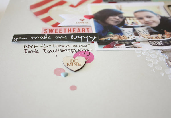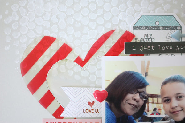
As you can tell I failed on the "no patterned paper" thing. I used a mask and some gesso to create the background on which to build my layout. I then layered several pieces from the Fancy Pants ephemera pack, the Crate Paper clear tags pack, a couple of Fancy Pants tickets, some My Mind's Eye puffy stickers, and a few Echo Park cardstock stickers.

I was also itching to try out the Tim Holtz Distress paint and found a way to incorporate it here too, the bonus was that it doubled as adhesive for the wood veneer pieces.

In order to add a little more definition to the acetate heart I used my sewing machine to stitch it to the layout. Once I finished adding all the pieces I wanted to the layout, it somehow seemed unfinished. After leaving it for a bit I realized that it need just a little more colour and definition, hence the addition of just a touch of patterned paper on the edges. So I didn't fully complete my challenge, but I did manage to use up several happy little pieces.
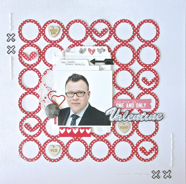
This second layout is a photo of my hubby that he had to have taken for his job. They wanted a headshot to put on their website, and to use for their PR Press Release introducing him, and outlining his new role for the company. I thought it would be fun to scrap the photo, as I'm sure one day we'll look back at it, and talk about how young and professional he looked (snicker).

Because it's a masculine layout, and one in which I really wanted to keep the focus on the pic (and less on the awesome scrappy product), I kept the embellishments to a minimum.

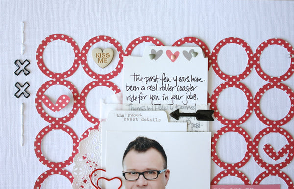
I used my Silhouette to create a cut file to use as a background, as well as my title, I then added a little flair to the edges by hand stitching. (the paper clip heart and chalkboard flair are from my stash)

This Elle's Studio cards worked nicely to record my journaling, and hide behind the photo. Hiding the journaling helps to still record the story, while keeping the layout clean. Two different layouts, two different approaches.
Thanks for popping in today friends! Pin It

8 comments:
gorgeous layouts!I think you did great challenging yourself!;)
These are gorgeous! LOVING the colors, the hearts and the circles!!!
Fabulous layouts, Sherri!
Wonderful layouts! Love your embellishment choices!
Awesome pages Sherri!!!
Great pages Sherri! Love how you used the embellishments on your first page and the fun die cut background on your second!
WOW!! Two WONDERFUL layouts!! Love all the added product in the first and the way you put together the one of your hubby!! What a great way to show you love him!!!
These are both so, so fabulous, Sherri! I adore the circle background you created. I'm working on a page right now with no patterned paper. Well, it's not done yet so who knows what will happen. LOL!
Post a Comment