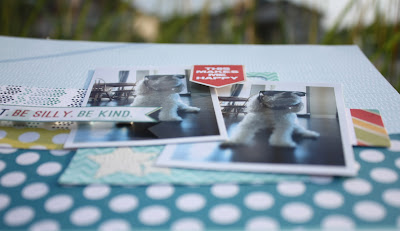
I decided to try something a little different this month and go a little flatter than usual with my Augusts kits. For this first layout, I really wanted to use a design that incorporated almost all of the patterned papers that came in the kit. I just love the way they all coordinate so well. Zero journaling on this one, which is a little different for me, but I thought the title and the photos were really all this layout needed.
For this layout I used mainly the I Found A Boy Add On Kit. I thought it would be fun to cut up this sheet and stick the squares back in place to add depth to the "flatter than usual" design.
I used the stamp form the Classy girl kit to emboss onto a scrap piece of cardstock in the centre of the photos.
See, pretty simple, but still gets the story recorded, and in an even faster time frame than I'm use to. These kits are so jam packed with product that I've made 4 layouts, and two cards. I even combined a bunch of the bits and pieces with my This Life Noted kit to create 2.5 spreads. I have so enjoyed working with these brighter, bolder, more masculine colours. The stamps are great too. It appeared at first that the kit had a more masculine bent to it, but once I started working with it, it became increasingly clear that the colours were great for many of the photos I had ready to be scrapped.
I'll have the rest of my projects to share with you soon. In the meantime hop over here to the gallery for inspiration from the rest of the Scraptastic DT and our members. You can follow along with the blog here.
Pin It


6 comments:
These are gorgeous!! LOVING the colors and loving the block design on the 2nd one!
Great layouts! I especially like the second one with all the different number elements.
These are fab Sherri!! Love the great design on both of your layouts!
Stunning layout my friend, looks like an amazing kit!!
Looks SO AWESOME my friend!
Great layout. I LOVE the top one. The blues are great.
Post a Comment