|
| We made a little stop at Tim Horton's to celebrate her 2nd last orthodontist appointment. July 15 can't come soon enough for this girl, she's even got a countdown running on her iPhone. |
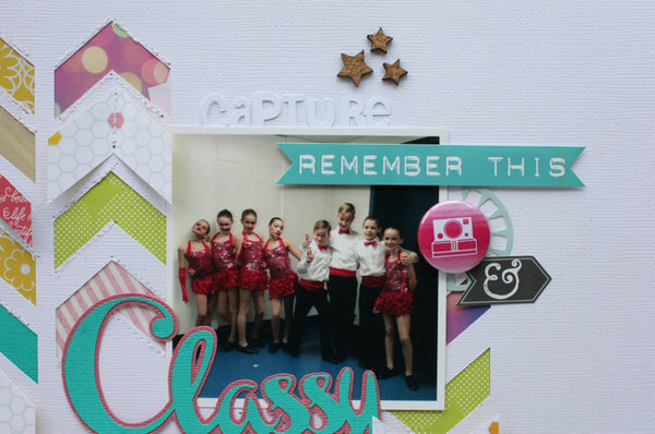
I just love the look of white on white, and the pops of colour in this collection make it even more fun to design tone on tone layouts.

I am so happy that Albert & Veronica to decided to create flair for their new collections, as you know I'm a sucker for great flair buttons.

Using minimal patterned paper, also allows me to easily mix and match remnants from my stash helping me to try and use it up, something I think we can all use a little help with right?! This little Fancy Pants pocket was perfect to hold my journaling tag, and matched so nicely with the rest of the collection.

Thanks for stopping by today friends! Pin It