Thursday, April 30, 2015

Our Clan *Fancy Pants Designs*

We've teamed up with The Cut Shoppe this month at Fancy Pants Designs.
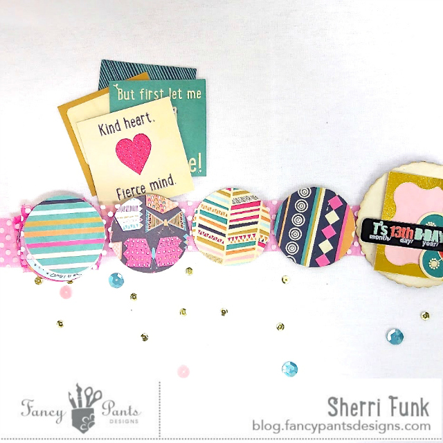
I fell in love with this geometric cut file, and knew it would be a great one to use with the fun patterns of the Flutter Collection.  The colours were a perfect match for this recent photo we managed to get with the whole family.

The scrabble tile alphas make a great title.  I used just a little Tim Holtz distress ink to make them pop off of the cream colour background better.  I also used one of the fantastic pre-cut scalloped pieces to separate the photo from the title.
Piecing together the background may look complicated, but it's rather easy when you simply offset the cut pattern, then adhere the matching pieces to the back of the matching size spot.

Using cut files to create your background, help to give your usual style a whole new look. Ashley has a store full of files to help bring your designs to a whole new level.  I am so glad we had a chance to partner up with The Cut Shoppe, it is fun to see the combination of great cut files, with delightful patterned papers.

You should hop over to the blog to see how other members of the DT used The Cut Shoppe files, and get yourself entered to win a $20 gift certificate to The Cutte Shoppe Etsy store.

Thanks for stopping by today friends!

Pin It

Wednesday, April 29, 2015

I love this Smile

I've got the spotlight on the new collections by Crate Paper on the Paper Issues blog today.

My layout, is based on top of one of my favourite types of cardstock.  The Tinaldo woodgrain is so luscious, I reserve it for only the best patterned papers.  Craft Market is one of those collections.
I used my silhouette to cut both my sentiment, and the petals out.  The über talented Paige Evans is the brain behind that fun flower design.  I used it to built my layout around using several items of the ephemera package.  The chipboard numbers on my page are from this package, are yet another thing I am going to have trouble using, once again it's the floral pattern that's getting me.

I promise you really should pop over to the Paper Issues blog to see what some of the super talented DT put together using some of the other collections, you will not be disappointed! 

One manufacturer, so many beautiful options for all your crafting.  It's time to pull out these gorgeous papers you've been hoarding and get crafting.  If you're still looking to get your hands on some of these beautiful papers and embellishments hop over to the Paper Issues store and get yourselves some.


Happy crafting friends! Pin It

Monday, April 27, 2015

Hello Sunshine

I've can't remember a time I created a layout around an oversized embellishment before. Pineapples are such a hot trend right now, that I just had to give this a shot using the summery-fun Citrus Bliss collection by Pink Paislee.

I used my Silhouette Cameo to draw a pineapple I downloaded from the Silhouette store, added holes for stitching, and went to town.  The finished product makes the page feel summery, and gets me anxious for the lazy days of August.

You can see full details on how I put this layout together here, on the Pink Paislee blog.

Thanks for stopping it today friends! Pin It

Monday, April 20, 2015

Altered ribbon spool - tutorial

Hi friends,

I wanted to share a tutorial I had up on the Fancy Pants blog recently.  It is a clever little altered project that popped up in my Pinterest feed a while back.


I started with this simple spool of ribbon 1.5" ribbon, that I picked up at the Dollar store, and a couple of embellishments from the Flutter collection that I thought I may want to use. 


To begin, I removed the entire length of ribbon form the spool, and then used my craft knife to separate the "lid" or top portion (where the price tag was located) from the spool itself.  This will expose the round cavity in the center that makes up the spool on which the rioon in wrapped.  I then decorated that top portion by cutting a round piee of patterned paper just slightly larger than the top of the spool to make it easier to act as a lit.  Cutting this piece larger than the "lid" itself, also gave me more space on which to add my embellishments (see the 1st image above).  You can also see in the photo above that I decorated the bottom of the spool in the same manner, and covered the plastic spool section with a strip of patterned paper.  


To create you photo strip, simply cut your selected photos into circles small enough to fit inside the cavity of the spool.  In this case my spool was slightly larger than 2.5 inches, therefore my photos measure exactly 2.5 inches in diameter.  Cut the same number of circles out of coordinating patterned paper, to act as the backing to your photos.

Remember that ribbon you removed from your spool?  Grab it and lay it down on your work surface.  Measure about 2 inches of ribbon and mark that spot.  It is at this point that you will glue the top of your newly altered lid.  Next to that, leaving very little space in between, begin to glue down your photos, neatly and straight, keeping the ribbon lined up directly in the middle of each photo.  


Notice that I cut just a few more blank pieces of cardstock to act as journaling cards, randomly placed in between some of my photos.  I even decided to make a title page to my album, as it just made the album seem more complete to have one.  

This is what the back side of my photo strip looks like.  Nothing fancy, just coordinating patterned papers from the Flutter Collection backing my photos.

Once all your photos and backing are added to your ribbon strip fold them up accordion style, like this, and tuck them into your newly altered ribbon spool container.


And there you have it, a sweet little photo box of sorts to store all your precious photos, and memories from a noteworthy even in your family.  This one is currently being loved and adored by my girl.  Thirteen is a pretty special birthday, and this little photo collection captures all the fun, and giggles, stories, and gifts, food, and friends with whom she got to share her special day.  

Thanks for stopping by today friends!


Pin It

Wednesday, April 15, 2015

Oh Happy Day

The big chunky die cuts in the Maggie Holmes Confetti ephemera package are so fun to use.  I love the font, and the gold foil.
These photos were perfect for the sentiment.  I usually use very thin double sided tape to adhere these types of cuts, but thought it would add a fun touch to the design to use my sewing machine to stitch straight through it instead.

One of the best things about Paper Camellia kits is that you can usually combine left over items from one kit with the next kit you receive.  Those gold Heidi Swapp numbers are a perfect example, with touches of gold in the April kit, it made it easy to decide what I had in my stash to use to add the date.  And those gold stickers from the My Mind's Eye sticker pack are so versatile.  I've used them in a few different way on my layouts this month.   Here I've added some 3D foam adhesive to the underside to give them some dimension off the page, then topped them with some enamel dots from my stash.

Clustering is possibly my favourite way to design a page.  Gathering little groups of randomly sized pieces create the perfect clusters.  The key to great layering, is to ensure each piece is a different shape and size from the rest.  In this section alone you can see 7 different layers.  Had I used 8 different layers of the exact same shape my cluster would look more like a bulky mess than this, simply because rather than creating movement to your page, your eye remains fixed, as though it is trapped in that one bulky spot.  

If you struggled with layering, perhaps this is the help you need to break out and try it again. Be sure to share you work with us in our Gallery, we'd love to leave you a little love.

Thanks for stopping by today friends! Pin It

Monday, April 13, 2015

Hello My Girl

It has been awhile since I played along with an Issue on the Paper Issues blog, and this one was worth the wait.  As you know I love kits, and this month I was happy to be included on this Issue as we have teamed up with Scrapbook Circle, using their March Main kit, March Printable, and cut files.

That acrylic Hello is my absolute favourite item in the kit, I based my entire design around that, and that super cute & whimsical background paper.

Just look at the detail on that patterned paper, it truly does look like I stamped all those details.  You should know me well enough by now to know how ludicrous it would be to give that idea more than a nano second of thought. That "enjoy today" is one of the  cut files from the kit.  I added a stitched circle to me design as I felt it helped to ground my design with so much going on, on the page.  The Janome  sewing machine that I won from Scrapbook and Cards Today last year had no trouble stitching right through the Pinkfresh wood veneer piece.

That great little kraft bag was part of the kit, and I added a kraft tag from my stash, on which to record my journaling about this photo.  It was a special little moment shared between Théa and I as she was waiting for her Tap Small Group session to being at Dance Competition a couple of years ago.  The cork pieces were another favourite from the kit.

Here is the March Main Kit in it's entirety.  So many great coordinating papers and embellishments, and it could be yours.

Simply link up to our Prints Charming's Beautiful Papers here on the Paper Issues Blog. As always, there are plenty of prompts to use to get the mojo going.  Your projects do not have to be new, and you may link up as many times as you would like.  One lucky winner will be randomly selected to receive this great kit.

And if you're in the mood for new scrappy goodies, there is much to be had in the Paper Issues store.  Did you notice that the new Fancy Pants collections are now available?  And then there's this super cute Kelly Purkey stamp, that is screaming for me to break open and get using.  No matter what you end up picking up, be sure to use my code to save 20% off everything in your cart.

Thanks for stopping by today friends! Pin It

Friday, April 10, 2015

Celebrating Thirteen

I have a teenager.  A second one, in fact.  When did I become so old?  I don't feel it (at least not most days), but it's a fact my sweet little Bean turned 13 recently.
She chose small and simple.  Five friends and bowling, followed by cake and gift and a sleep over.  It was easy peasy, my favourite kind of party.  My girls will not grow up remembering the amazing parties I threw them as they were growing up.  No, but the will hopefully remember the way I loved their friends.  They way I encouraged them to make our home their home.  And these 5 girls were no exception.  Théa has made such great decisions with her friend choices.  These girls are sweet, and kind, and respectful, and just enough crazy and loud for her personality.  Having them over for the night was a no-brainer.

I recently spoke about my rule of how to create great layers that work.  Here is another example: six layers that don't add a lot of bulk to my page because they are different sizes and shapes.

I have found that a great way to adhere the acetate sentiments is to add thin strips of double sided adhesive behind the thicker portions of the font, so it is completely invisible from the front.  In this case I used one that is a 1/8" width. It' super tacky, so therefore I really didn't need too much to ensure a good hold to my patterned paper. 

My layout is based on the April Sketch.  You still have a little time to link up your own take in the comments on this post for your chance to win a $10 gift certificate to the Paper Camellia store.

Thanks for stopping by today friends!
Pin It

Tuesday, April 7, 2015

You 2 Lovelies

The April Kits from Paper Camellia are now available in the shop.
I just had create something using that gorgeous woodgrain background paper straight away.

I just love the way our neighbour girl loves my girls.  So glad her mom captured this photo of them together.  She told me later that her little one had told her how much she wishes she had a sister.  She has two super cute big brothers in her life, but I get the desire for a sister, at 41, I have a great younger brother, but I still have that same desire for a big sister in my life.
I used a Jillibean Soup pocket, and a tag from my stash to record my journaling, and tuck it behind the photo cluster. 

The April Main Kits, are another gorgeous collections of pretty papers and embellishments.  I especially love the Craft Market chipboard stickers.   
There are still a few April kits left. You can get your hands on one by hopping over here.  But don't wait too much longer or they will be gone for good.

Check out all the kits and Add On right here on the paper Camellia blog.


Thank you for stopping by today friends! Pin It

Friday, April 3, 2015

I Am Grateful

The much anticipated I AM collection by Simple Stories did not disappoint.  There are so many great elements in the collection that I actually struggled to not use each and every piece on my layout. That is always a great problem in the life of a scrapper.
I used the collection to create a long overdue layout about where I feel I am in life during this chapter of life.

 Can you tell that the chipboard frames are my favourite element of the collection?  I used 3D foam adhesive to layer them over other elements and pop the page.

The scripty veneer pieces in the collection are gorgeous, I just love the font, and they're thick enough to get a good grip when adding glue to the back.  Here I layered it directly over one of the frames, that was also layered over top of a cardstock tag.

Because the journaling is so personal I chose to keep it tucked behind my photo on a shipping tag.  I incorporated the butterflies to symbolize the freedom of getting older and discovering who you were meant to be.

Still looking to get your hands on this collection?  Many of the elements are available in the paper issues store right here.  Use my code and save 20% off everything in your cart.

Happy shopping friends!
Pin It

Thursday, April 2, 2015

On Pointe

I have been holding onto this photo that my daughter snapped one day while watching her friends practice before Pointe class.
This photo perfectly sums up why it is that so many little girls want to grow up to become ballerinas.  There is just something so attractive about pretty, pink pointe shoes.  Pair them with a beautiful tutu, and we're sold.


The colours in the Paper Camellia March Kit are so soft and feminine it was finally time to scrap this memory.  I used some 3D adhesive to pop the tiny close up photo off the page, and added a little chipboard butterfly and gemstone to embellish it, making it stand apart just a bit.

I am a sucker for seam binding , and love the Ria includes it so frequently in her kits. Here all I did was weave a piece of thread through it with a needle and gathered it a bit creating a pletes.   I used my sewing machine to stitch it down.  I am only sad that I did not place it a little further down from the base of my photo, I miscalculated how much of the pointe shoes would be covered once the ribbon was stitched down.  Live and learn right?

Thanks for stopping by today friends! Pin It